
You’ve got two solid options. Match your trim to walls for a seamless, calm space that feels bigger—especially in smaller rooms.
Or contrast them to highlight your home’s architectural details and create visual interest.
Your best choice depends on your room size, home style, and the vibe you’re after.
Even sheen differences (eggshell walls, satin trim) can define trim without clashing colors.
There’s a lot more to consider before you commit.
Matching Trim to Walls: When Cohesion Matters Most
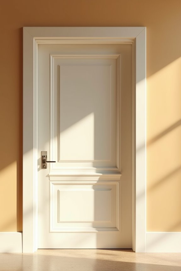
Why does matching your trim color to your walls sound so boring, yet looks so polished? When you choose the same color for both, you’re creating a seamless, unified space that feels deliberate and calm.
This approach minimizes visual breaks throughout your room, making it feel larger and brighter. You’ll reduce decision fatigue too, since you’re committing to one consistent color story. It’s particularly effective in historic or traditional homes, where matching trim and walls soften transitions between adjoining areas.
Here’s the trick: vary your sheens. Use eggshell for walls and satin for trim to maintain subtle depth without clashing. This creates the polished look you’re after while keeping everything connected.
The result? A sophisticated backdrop that lets your furniture and accessories stand out.
Contrasting Trim: Showcasing Architectural Details
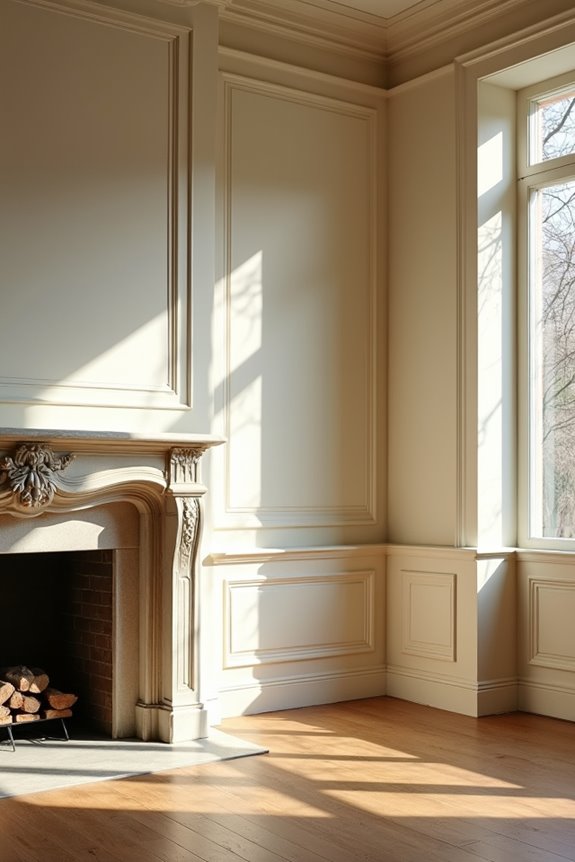
When you choose a contrasting trim color, you’re basically drawing attention to every molding, panel, and door frame in your room—think of it like putting a spotlight on the architectural bones of your space. You can go bold with this approach, pairing dark walls with crisp white trim for a modern punch, or flip it by using darker trim against lighter walls to emphasize the room and make those details stand out. The key is that you’re not trying to blend in; you’re making a deliberate design choice that says, “Hey, look at these cool features I’ve got.”
Architectural Details Stand Out
How’d you like to show off the best features of your room instead of hiding them?
When you choose a trim contrast that differs from your wall color, you’re making those architectural details pop. Paneling, moldings, and door frames become prominent design elements that draw the eye and celebrate the craftsmanship in your space. A darker trim against lighter walls creates clear visual boundaries, emphasizing niches, stair rails, and built-ins you’ve worked hard to create.
This strategy doesn’t just highlight features—it defines your room’s layout. The separation between trim and walls makes structural elements feel deliberate and polished. You’re directing attention to what matters in your design. By using contrasting wall colors with your trim, you’re turning ordinary architectural details into design statements that command attention and add character throughout your space.
Bold Color Blocking Impact
Bold color blocking works when you use contrasting colors to create sharp visual lines that guide your eye around the room, highlighting moldings, panels, and door frames with intention.
Pair light walls with dark trim—or reverse this for a contemporary approach. Consider Dock Blue walls with Gauze-Mid trim, or use Lamp Black trim against Bone China Blue. Two-tone schemes work well when you apply saturated trim colors against white or light walls.
Match your paint sheens for the best results. Pair eggshell walls with satin or semi-gloss trim to achieve crisp transitions. Bold contrasts require consistency in finish to look polished rather than accidental.
Choose Your Trim Style: Five Key Decision Factors
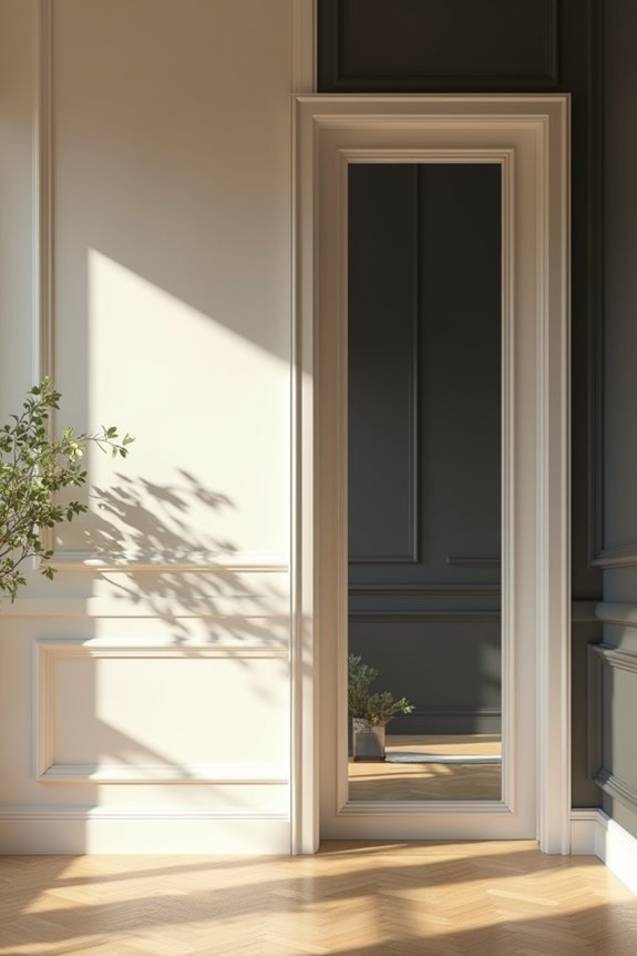
What’s the best way to decide whether your trim should match your walls or stand out? You’ve got five key factors to guide you. Consider these important decisions:
- Color harmony with your walls – Does matching create a unified look you prefer?
- Your home’s architectural style – Does contrasting trim highlight your moulding details?
- Room size and lighting – Does your choice make the space feel bigger or cozier?
Think about whether you want a traditional, unified vibe or a contemporary contrast. Don’t forget maintenance either—keeping one trim style consistent across doors, cabinetry, and walls means less work later. Your sheen choices matter too. When walls and trim share colors, eggshell walls paired with satin trim prevent awkward mismatches. You’re creating your home’s character here, so pick what works for you.
How Room Size Changes the Matching vs. Contrasting Choice
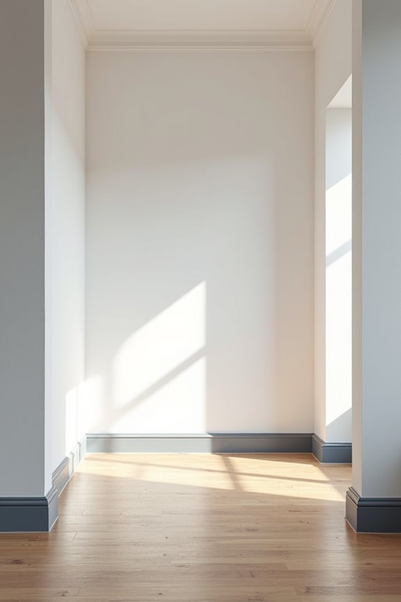
Ever notice how some rooms feel cramped while others feel spacious, even when they’re roughly the same size?
Room size dramatically changes your trim decision. In smaller spaces, matching your walls and trim creates a monochromatic look that expands perceived space. You’re eliminating visual boundaries that typically divide areas, making everything feel more open and connected.
Conversely, contrasting trim draws attention to architectural details and room edges—which actually makes compact rooms feel smaller. Two-tone approaches create definition, but that definition can work against you in tight quarters.
For larger rooms, you’ve got more flexibility. Contrasting trim adds visual interest without cramping your space. The key? Match walls and trim in small spaces to maximize openness. Your room will look intentionally designed, not visually boxed in.
The Sheen Solution: Define Trim Without Color Contrast

If you’ve decided matching walls and trim works best for your space, you don’t have to settle for a flat, one-dimensional look. You can define trim through sheen choice instead of color contrast. By using the same color family with different finishes, you’ll create depth while keeping things cohesive.
- Pair matte walls with satin or semi-gloss trim to subtly differentiate surfaces through light reflection
- Use eggshell walls and satin trim for a softer, more nuanced approach that still shows distinction
- Apply flat ceilings, eggshell walls, and satin trim in sequence to build layered visual interest
This strategy reduces visual breaks between rooms and emphasizes your home’s architectural features. You’ll achieve a polished result through deliberate design choices that maintain visual continuity without harsh contrasts.
Historic Homes and Monochromatic Paint: Why It Works
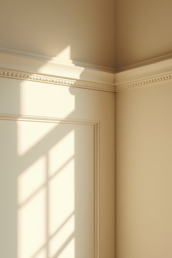
When you’re renovating a historic home, painting your trim, walls, and even ceilings the same color can bring out the charm you’re trying to preserve—particularly when you choose blues, beiges, or warm pinks that match the era. You’ll want to use different sheens (like eggshell on walls and satin on trim) to add subtle depth without breaking up that unified look, which keeps your period details visible and prominent. Dark tones work particularly well with this strategy because they allow the craftsmanship of your beadboard and architectural accents to stand out without creating jarring visual interruptions.
Vintage Character Through Unified Color
What if your historic home could feel authentically vintage without that stark white-trim-against-colored-walls look? You can create something better—a unified color scheme that wraps your space in warmth and character.
When you paint your trim and walls the same color, you’re building a cohesive palette that feels deliberate and timeless. Historic homes work well under this approach because it honors their era while celebrating what makes them distinctive.
Here’s what you’ll gain:
- Architectural details recede gracefully, letting your collected objects and textures become the focal points
- A rich, vintage atmosphere that feels genuine rather than forced
- Visual continuity that makes rooms flow smoothly together
The key? Manage your paint sheen carefully—use eggshell on walls and satin on trim to avoid awkward depth mismatches, especially with darker tones. Your historic home deserves this unified treatment.
Historic Renovations and Color Application
Now let’s see how this unified-color approach actually plays out in real historic homes. You’ve probably noticed how painting trim and walls in the same cohesive color affects spaces. Consider the West End bathroom—blue trim with matching beadboard walls creates harmony around period details. Martha’s Manor’s powder room does this with deep purple across everything.
Here’s what makes this work: matching sheen matters. Use eggshell or satin finishes on both walls and trim to avoid depth problems with darker colors. This keeps your historic renovations looking intentional, not accidental.
The unified approach ties architectural features together. Your clawfoot tub, paneling, and original trim become one cohesive background. You’re not fighting against your home’s character—you’re celebrating it. This strategy works because it respects what’s already there.
Dark Tones and Sheen Strategy
Why does painting your entire historic bathroom in deep charcoal feel so different from slapping the same color on walls and trim separately?
The answer lies in sheen strategy. When you’re working with dark tones, matching your walls and trim in the same color works well—but only if you’re intentional about finish consistency. Here’s what you need to know:
- Use eggshell on walls for subtle, soft coverage
- Apply satin on trim to add depth without breaking your unified look
- Keep the color identical across both surfaces for cohesion
This slight sheen difference maintains that enveloping, intimate feel while allowing your trim to subtly recede. You’ll avoid visible color discrepancies that make spaces feel disjointed. The glossier trim reflects light just enough to define architectural lines without abandoning your monochromatic vision.
Small Spaces Feel Larger With Matching Trim and Walls
Have you ever noticed how a room can feel instantly more spacious just by changing what you paint?
When you match your walls and trim in the same color, you’re creating a monochromatic scheme that tricks your eyes into perceiving more space. This unified approach eliminates visual breaks that typically shrink a room. Light, cohesive colors work especially well—they minimize depth cues that make compact areas feel cramped.
| Strategy | Benefit | Best For |
|---|---|---|
| Matching trim and walls | Smooth transitions | Small bedrooms |
| Light monochromatic palette | Expanded perception | Apartments |
| Uniform color scheme | Calm atmosphere | Tight hallways |
You’ll notice how this approach creates smooth transitions between adjacent areas. Your space perception improves instantly. Plus, you’ll highlight architectural details without competing colors distracting your eye. This simple strategy changes how you experience your home.
Creating Drama in Doorway-Heavy Spaces With One Color

When you’ve got multiple doorways competing for attention, painting everything the same color actually creates drama instead of chaos—you’re directing your eye’s focus by removing distractions. Bold color choices matter here; a deep blue or rich gray across walls, trim, and doors unifies all those entry points into one cohesive design statement rather than scattered visual interruptions. By reducing architectural clutter this way, you’re giving your space a confident, intentional appearance that feels both sophisticated and spacious.
Visual Impact Through Unification
Painting your walls, trim, and doors all the same color can actually make a busy hallway feel more intentional and dramatic, not bland.
When you choose unification over contrast, you’re creating visual cohesion that ties everything together. This single color scheme works especially well in doorway-heavy spaces because it:
- Reduces visual clutter by eliminating competing color lines between trim and walls
- Emphasizes your architectural details instead of fragmenting them across multiple colors
- Makes the corridor feel larger by softening depth cues and transitions
The result? Your hallway becomes a unified, dramatic backdrop rather than a choppy sequence of separate elements. Your eyes flow smoothly from one doorway to the next, experiencing the space as one whole instead of fighting multiple visual interruptions.
Reducing Architectural Clutter
Why does a hallway packed with doors feel so visually exhausting?
When you paint walls and trim different colors, your eye bounces between contrasts, creating visual noise. Instead, try painting everything one unified color. This approach eliminates the visual breaks that make doorway-heavy spaces feel chaotic.
A single-color scheme works because it treats your trim, walls, and doors as one continuous surface. Your eyes don’t jump from wall to trim to door frame—they flow smoothly through the space. The result? Less clutter, more calm.
You can still add interest by varying paint sheen. Use eggshell on walls and satin on trim for subtle depth without creating harsh contrast. This strategy keeps your hallway organized and visually cohesive, reducing the sense of disorder in a space with many architectural elements.
Bold Color Choices Matter
The beauty of matching your walls and trim isn’t just about reducing visual noise—it’s also your chance to make a real design statement. When you embrace bold color choices in doorway-heavy spaces, you’re creating cohesive spaces that feel deliberate and confident.
Consider these dramatic approaches:
- Deep jewel tones (like rich blue) unify walls, trim, and doors while delivering serious visual impact without white trim competing for attention.
- Satin or semi-gloss finishes on trim paired with matte walls enhance the dramatic contrast through texture rather than color alone.
- One unified color across all surfaces makes openings feel bolder and more architectural, turning ordinary hallways into thoughtfully designed destinations.
Your bold color choices demonstrate purposeful design—a space that was clearly planned rather than randomly assembled.
Softening Room-to-Room Transitions With Unified Color
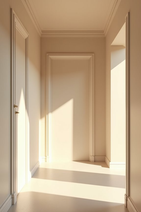
How do you make your home feel like one unified space instead of a bunch of separate rooms? Paint your walls and trim the same color. This unified color approach softens transitions between rooms, especially in open-plan areas where choppy visual breaks can interrupt flow. When you keep walls and trim matching, you’re creating a consistent look that guides visitors smoothly from your dining area into your living space without jarring shifts.
The benefit? White walls with matching trim actually recede, making adjacent spaces feel more connected and spacious. You don’t need identical finishes—try eggshell on walls and satin on trim. This subtle sheen variation maintains your consistent look while still softening those transitions. Your home becomes one welcoming journey instead of disconnected rooms.
The White-on-White Challenge: Spotting Undertone Clashes
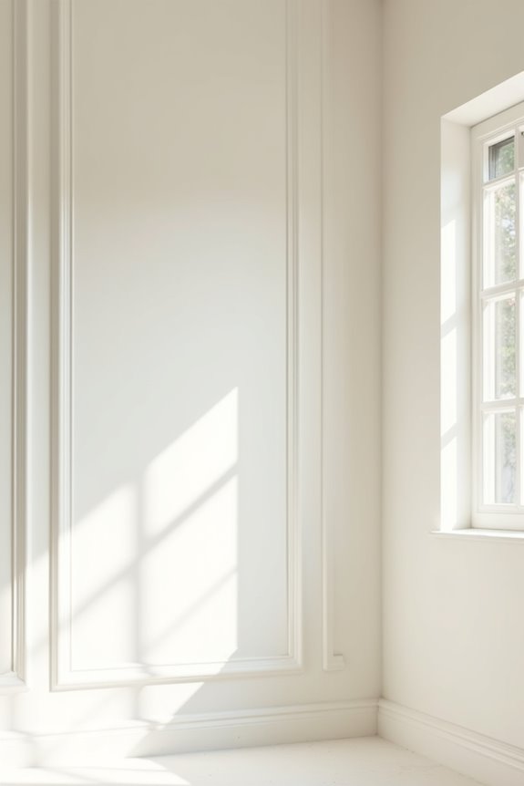
You’d think picking two white paints would be simple, but undertones—those hidden purple, pink, or blue hints—can make one white look dingy or off-color next to another. The good news is you can spot these clashes before painting by testing samples in your actual lighting, using a paint store’s color-matching machine, and comparing how Decorator’s White trim might clash with Chantilly Lace walls (or whichever pair you’re considering). Start with small samples on your trim and walls, live with them for a few days in natural and artificial light, and you’ll quickly see whether you need to stick with the same white family or go with real contrast.
Undertone Recognition and Selection
Ever noticed how one white paint looks almost yellow next to another white, or how a trim color suddenly appears pink when you put it beside your wall?
That’s undertone clash, and it’s more common than you’d think. Here’s what’s happening: whites aren’t actually neutral. They carry subtle yellow, pink, or blue undertones that shift dramatically when placed side-by-side.
To avoid this:
- Check the LRV (light reflected value)—a number showing how much light a color bounces back. Pair a bright white trim with a wall white that has a lower LRV for better white balance.
- Compare samples in your actual lighting, not the store.
- Choose the same white family for consistency, or commit to a noticeable contrast instead of confusing undertone shifts.
This approach keeps your space feeling deliberate and cohesive.
Coordinating Whites Without Clashing
The white-on-white look sounds simple until you’re standing in your living room wondering why your trim doesn’t quite match your walls. Here’s the thing: two different whites create visual contrast you didn’t plan for. One surface reads milkier or grayer than the other, making undertone clashes impossible to ignore.
The solution? Start with bright white trim and choose walls with a slightly lower LRV (light reflectance value). This balance reduces noticeable shifts across your space.
| Surface | Best Approach |
|---|---|
| Trim | Bright white (higher LRV) |
| Cabinets | Bright white (higher LRV) |
| Walls | Lower LRV white |
| Sheens | Match throughout |
| Undertones | Same family |
Matching sheens matters too—they minimize color divergence. Your whites will harmonize well when you keep these principles in mind.
Testing Before Full Commitment
How do you know if your whites’ll actually work together before you’ve painted your entire living room?
Testing before commitment saves you from expensive mistakes. You’ll catch undertone clashes that aren’t obvious at first glance, especially in white-on-white schemes where subtle differences become obvious once paint dries.
- Paint large sample swatches (at least 2-by-2 feet) on your walls and trim in different areas
- View them in multiple lighting conditions—morning sunlight, afternoon light, and artificial evening light reveal how undertones shift
- Let samples dry completely because wet paint appears different than dried paint, and undertones become clearer over 24 hours
Testing takes patience, but you’ll feel confident knowing your whites complement each other rather than clash. This small step prevents regret and keeps your space looking deliberate and coordinated.
Budget and Application Costs: Matching vs. Contrasting
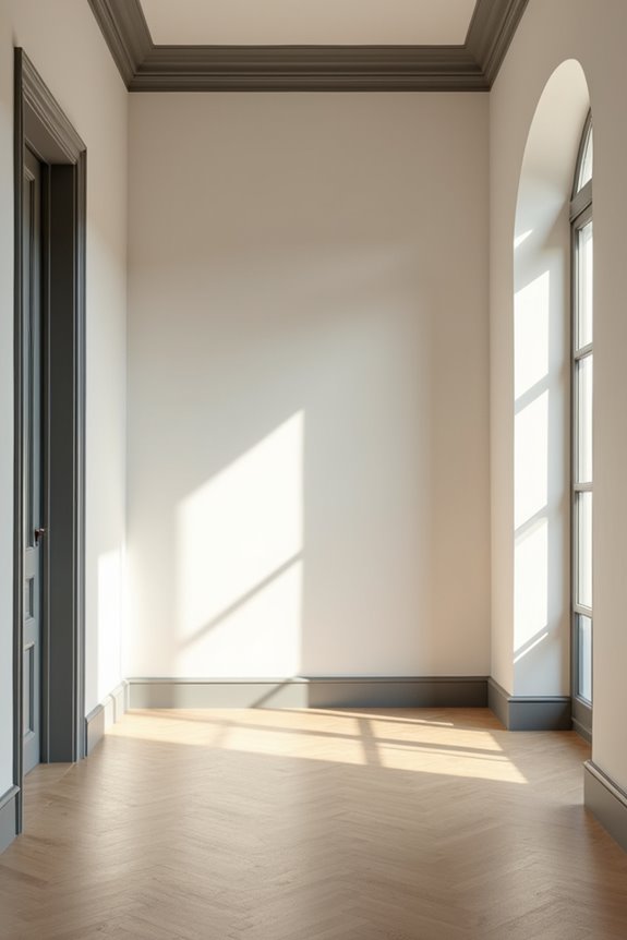
When you’re deciding whether to match your trim to your walls or go for contrast, your wallet deserves a seat at the table. Matching trim and walls simplifies your project, reducing the number of paint colors you’ll need and speeding up application time. This approach cuts labor costs appreciably since painters don’t need precise edge-work or extensive masking.
Contrasting trim demands meticulous attention to detail. Your painter must carefully mask edges and apply paint with precision, which increases both labor time and costs substantially. You’ll also purchase more paint cans, creating unnecessary waste.
For larger rooms, matching colors means fewer materials overall. In historic spaces, single-color approaches eliminate specialty paint needs entirely. When budgets are tight, matching trim to walls is your most economical choice.
Test Your Trim Color Under Real Daylight Conditions

Ever noticed how a paint color looks different in the store than it does on your wall at home?
That’s because daylight affects how you perceive color. Before committing to your trim color choice, you’ll want to test it under real conditions throughout the day.
- Observe your trim color at three different times: morning, noon, and late afternoon to see how natural light shifts the undertone from blue to pink to yellow.
- Bring actual paint swatches and compare them directly on your trim with adjacent wall color in the room, not on small sample boards.
- Record the perceived brightness and contrast in both bright sun and shaded corners to evaluate how well they work together.
If daylight makes your trim look too different from your walls, adjust the shade or matching finish sheen for uniformity.
One Color Across Walls, Trim, Ceiling: The Cozy Effect
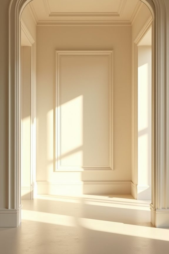
Why do some rooms feel like a warm hug while others feel choppy and disconnected? When you paint your walls and trim the same color, you’re creating a one-color scheme that wraps the room in comfort. This unified approach eliminates visual breaks that interrupt your eye, making spaces feel seamless and intimate.
A light-on-light contrast approach works especially well. Lighter hues expand perceived space while brightening everything around you. Your furniture and accent pieces naturally become the main visual interest without competing architectural interruptions.
Here’s the approach: vary your sheen slightly. Try eggshell walls with satin trim. This subtle distinction maintains depth and prevents flatness without breaking your unified color story. You’ll achieve that enveloping warmth that makes a house feel inviting.
Paint Application Order: Walls First or Trim First

Now that you’ve decided on your color scheme—whether you’re going all-in on one unified shade or playing with contrast—you’ll need to figure out the actual painting order.
Your paint application order matters more than you’d think. Here’s why: the choice between trim first or walls first affects how you’ll handle edges and achieve clean lines. If you’re creating contrast between trim and walls, painting trim first gives you protection. If you’re going unified, walls first works well.
- Trim first: Protects woodwork from wall roller splatters and creates sharper edges
- Walls first: Easier for unified schemes since you can feather edges naturally
- Caulk before either: Seal gaps between trim and walls for professional results
Either approach works—just pick one and commit to it.
Your Trim Decision Checklist Before Picking Paint
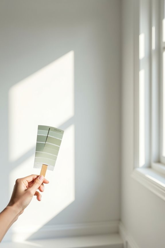
Before you crack open that paint can, take a moment to work through a few key questions about your trim.
Ask yourself these things: Do you want your walls and trim to feel unified or distinct? Consider your room’s size—matching color makes spaces feel larger. Think about your home’s style. Historic spaces often work well with single-color approaches, while modern homes benefit from a unified appearance.
Next, check your sheen options. If you’re matching color, you’ll need complementary sheens. Eggshell walls pair nicely with satin trim, avoiding awkward visual clashes.
Finally, evaluate your architectural details. Same-color trim downplays fancy molding, while contrasting color highlights it. Consider what matters most: emphasizing details or creating continuity? These answers guide your color and sheen choices.